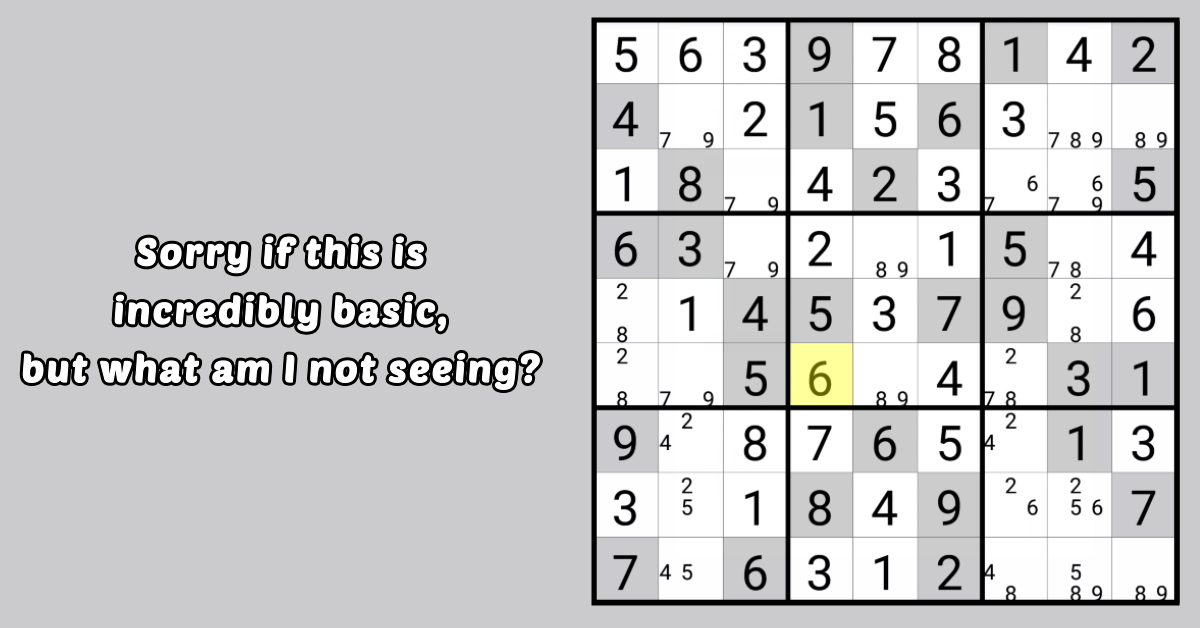
Visual Design and Eye Comfort Features for Long-Term Play
Visual clarity and interface comfort are critical factors in puzzle-solving efficiency. In Sudoku - Classic Sudoku Puzzle, design decisions are carefully optimized to support prolonged concentration and reduce visual fatigue.

The app uses high-contrast yet balanced color schemes to distinguish grid lines, numbers, and highlights. This ensures that players can easily recognize puzzle structures without excessive visual strain.
Font design prioritizes readability. Numbers and symbols are rendered with consistent spacing and smooth edges, minimizing misinterpretation during fast scanning.

Eye comfort mode adjusts brightness, color temperature, and background tone. This feature is particularly useful for evening play sessions and extended training periods.
Customizable board skins allow users to personalize visual environments. Players can choose minimalist layouts for focus-oriented play or themed designs for relaxed enjoyment.

Interface responsiveness further enhances comfort. Smooth transitions and stable animations prevent distracting flicker or sudden visual interruptions.
Adaptive layout scaling ensures consistent usability across different screen sizes, including tablets and small smartphones.
By integrating ergonomic principles with aesthetic simplicity, Sudoku - Classic Sudoku Puzzle delivers a visually sustainable puzzle-solving experience.